I’ve redesigned my website several times and have spent the past few years running Chyrp, a lightweight PHP blogging/tumblogging engine. After I learned the lead developer would no longer actively develop Chyrp1, I stopped watching the community and kind of let my site rot. I was busy doing Relatively Early work where I was exposed to Harmony and I instantly fell in love with it. Building and maintaining client sites on it is a breeze, and it’s fun to do. After learning what I could do with it I decided to port my site over, wanting to simplify things anyway.
Although I will miss being involved in the development community of an open-source blogging engine, moving to Harmony provides me with lots of data flexibility and options without the hassle of maintaining my own software installation. The guys at Ordered List keep rolling out awesome new features. No, it’s not free, but the monthly cost of hosting + a killer CMS is very fair.
As for the site structure, I wanted a simple blog where I could highlight some projects I’ve worked on without feeling like I was juggling a bunch of pages or splitting things up into categories. The home page is just a blog where you can access tags and archives at the bottom or from article headers.
To highlight projects I thought were significant I threw together the campily-named “Lifetime Achievements” section. Clicking on the tagline in the page header reveals an icon grid of blog posts about big projects. I had a little too much fun with CSS3 animations and transitions. The name/date sorting functionality is made possible with Quicksand. I think it will be a fun and fairly painless way to document things I’ve worked on.
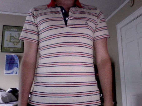
The overall design and colors are based on my favorite shirt:
I’ve moved most of my old posts over, but this is more of a fresh start. A webby do-over!
1 Although it seems that semi-recently Chyrp was kicked into active development again and released a 2.1.